I’ve been in the website design field for about a decade. While technology continues to change at lightning speeds, the fundamentals of an effective website, has not changed much from when I first started.
With a website, the possibilities are endless. You can create hundreds of pages, as long as you want, with tons of images and text. However, effective marketing in this digital age means that you only have a few seconds to communicate your message to your audience. Walls of text in the wrong location of the website with hard to find vital information, is detrimental to your branding.
Good news is that most of the issues that I see on many of the websites I visit can be easily fixed. Identifying these issues is the hard part. Here are the top 6 website design mistakes I’ve seen:
1. An Ineffective “Above the Fold”
This is a term borrowed from the newspaper industry. Everything that a website visitor sees once the page loads on the screen is considered above the fold.
With the onslaught of information coming at our eyeballs every day, you only have a few minutes to make an impression and entice them to stay on your website. The information displayed have all of the following characteristics:
- Aesthetically Pleasing – think large hero images, video, or slideshows
- Straight to the Point – state your mission statement or branding message here in a few short words
- Directional – what should your visitors do once they are at your website? See: Call to Action below
2. An Unclear Call to Action
What is the purpose of your website? Do you want a visitor buy a product, contact you for a quote, or schedule an appointment?
If you do not have a clear call to action on your website, you are wasting a valuable marketing tool. Visitors don’t want to waste time looking for a way to connect with you. You should have call to action buttons above the fold, on every page, and as frequently as possible without being annoying.
3. Missing Location
Unless you are an e-commerce store, you should have your location listed. The standard is to state your location or service area either in the:
- header
- footer
- contact page
- or any combination of the above
Even if your target market is across multiple locations, you want to make sure you state that. Don’t keep your audience guessing. You don’t want them to burn brain cells trying to figure out if they are in your service area or not.
4. Generic Images
Including images is a great way to break up copy and make a website look aesthetically pleasing. However, stock photography isn’t effective if it is not relevant to the topic or convey your personal brand.
In a recent study, a marketing group tested a form on their website. When they swapped out the stock image of a customer service representative with an image of their CEO, their conversion rate on that form increased by 34.7%!
You offer something unique, and your potential clients need to see what that is and that they can trust you. Images of your existing customers using your product, you interacting with your clients, your storefront– are all examples of images that can be used on your website and social media to built trust. See my personal brand photography page for more information about using images on your website.

5. Walls of Text
In this modern age when you only have a few seconds to impress a visitor, you have to make it count and a wall of text is not going to do the trick. Here are some tips on how to do that.
- Parse down your copy
- Deliver a clear branding message
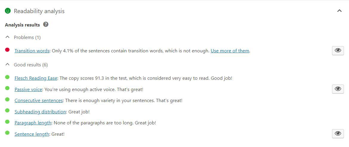
- Make the copy web-readable (a great tool for this is Yoast SEO)
- Break up text using lists, headings, images, animations, and bolded words
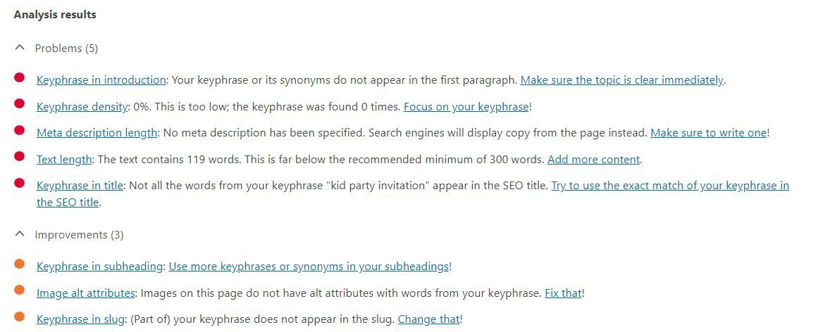
6. Non-Existent SEO
There are SEO experts out there that can make your website rank high on search engines for thousands of dollars. But if you are leaving your webpage title and description blank and hoping your website will magically fill in the best keywords, you are sorely mistaken.
Yoast SEO (a plug-in for WordPress) is a great tool assess readability as well as SEO. Just like how it grades the readability of your copy, it rates how well your SEO is configured based for a targeted keyword.
Does your website include any of these mistakes? Leave a comment below or contact me if you’d like to further discuss your website design needs.